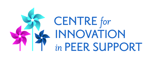
We are excited to share our new logo.
After a very long process we are very excited to share the logo for the Centre for Innovation in Peer Support. Our Centre colours will be bright blue, navy blue, magenta, and charcoal grey. The journey to pinwheels was an interactive process that started with flower petal designs being misinterpreted as propellers which eventually lead to pinwheels. The meaning/symbolism of pinwheels is below.
Symbolism of Pinwheels
- A visual metaphor–always turning, spinning, and offering up a kaleidoscope of wisdom, grace, dignity, and colorful possibilities.
- The diversity in the human condition & the energy of life.
- The dual notions of movement and stillness.
- The powerful energy behind our inner voice.
- Strength as well as fragility.
- Obstacles and freedom.
- Pinwheels make people feel energetic and inspired
If you want to know more about the Centre please see the Promising Practice post previously on EENet Connect at the link below: (The Centre was previously known as the Enhancing & Sustaining Peer Support Initiative)
Centre for Innovation in Peer Support: A Promising Practice


